Design at Neverinstall

With advancing technology, designing UI has become a deterministic factor for user experience. Making complex technology understandable for a user takes a lot of design engineering. This blog entails the science and the thought process behind designing Neverinstall’s UI.
Let’s dive into three broadly categorised design strategies used in Neverinstall.
1. User-Centric
Our product has rapidly evolved in the past year and crossed several milestones. With each milestone, our designs have changed. We follow a user-centric design approach and hence primarily the designs were made for the users and then considering the business and visual appearance.
2. Simplicity
"Design is not what it looks like. Design is how it works".
For a user to fathom the product’s functionalities, the UI must be simplistic and self-explanatory.
3. Product zeitgeist fit
Product Zeitgeist Fit refers to the commonality between a product and the current cultural or societal trends and values. For example, if we include a few elements in the design to signify our participation in making the environment greener, it's easy to attract those users to our platform.
Eg: This message is displayed whenever a user pauses the space. “By pausing your workspace during the inactivity, you are saving 20 grams of CO2/Megabite from going to the environment”🌱.
The history of Neverinstall can give a bird's eye view of our design evolution.
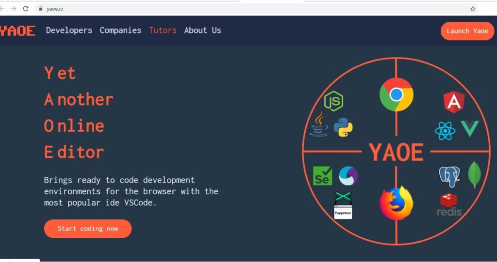
YAOE - Where we began
The origins of Neverinstall lie in YOAE (Yet Another Online Editor), an online code editor in the browser–leveraging the capabilities of the cloud. But it restricted full-fledged coding experience, unlike the IDEs.
The rudimentary design of the platform was created to support and serve only developers. But as we started opening up the platform to other users, we had to catch up to their needs.
Neverinstall 1.0: The future of App Streaming
Moving on from online editing, we chose to take the path of a full-fledged browser-based computing platform that enables one-click access to desktop apps. We wanted access to be simple, direct, and intelligible by every user.
The first iteration of Neverinstall as a next-generation personal cloud computer came with the following capabilities:
The ability to view and choose an app.
The ability to launch the app in a “Space” without installation or configuration.
The ability to view which apps are launched on the platform.
The ability to remove apps.

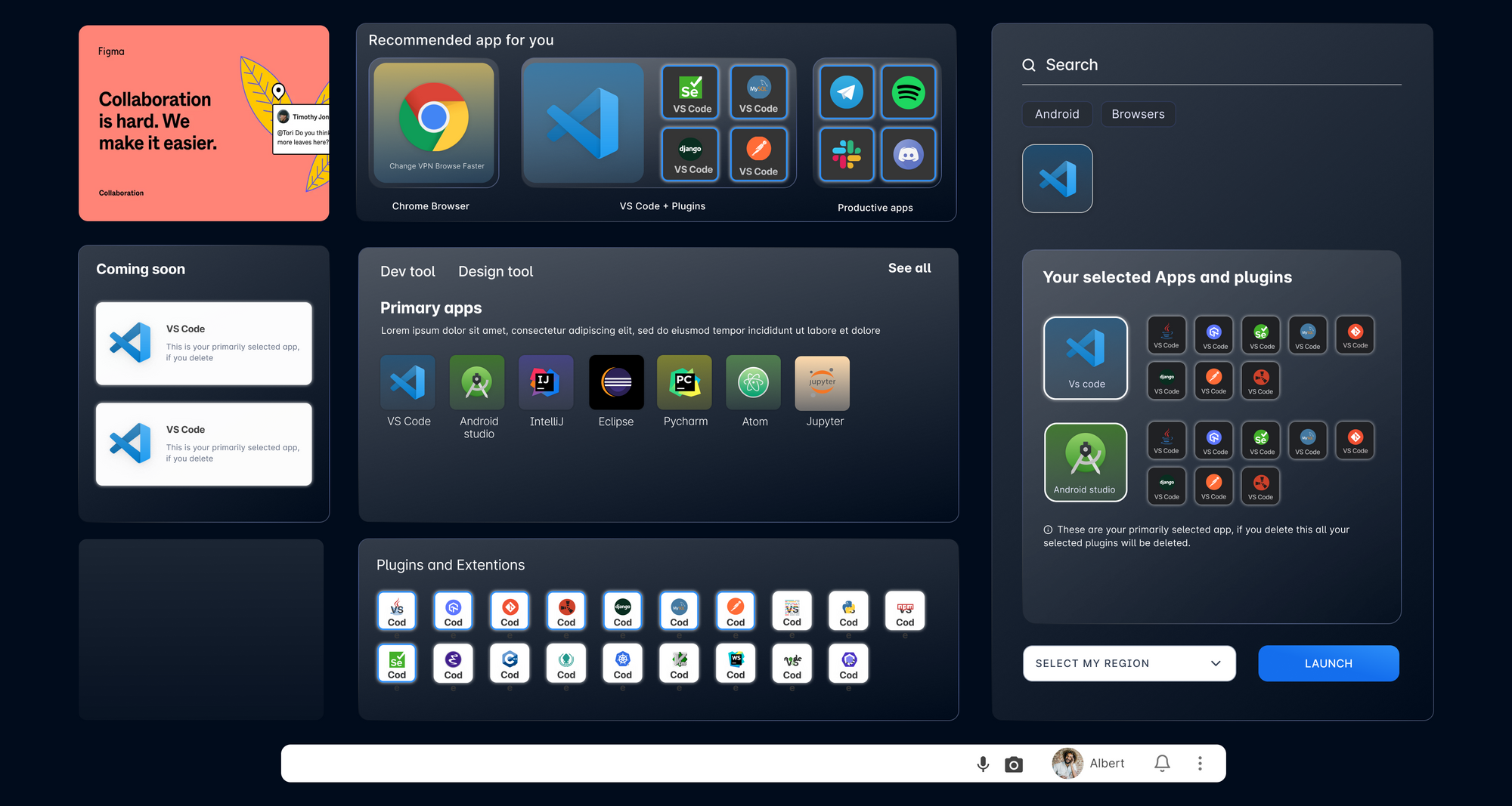
Neverinstall 1.1: The pivot
Moving forward, we understood the need for a more intuitive platform. Neverinstall had crossed 100,000 users on the platform by this time, and we required more orders and functionality.
To solve these problem statements, we conceptualised workspaces–virtual instances where users could access their apps in a dedicated section on the platform–to get an overview of a user’s selections.
Multiple Apps
We added a section on the top which included a popular collection of apps that people needed to have in their workflow. This idea was a game-changer for us. Launching a personal and powerful Cloud PC was just a click and seconds away.
Launching Subscriptions
We added a section on the top which included a popular collection of apps that people needed to have in their workflow. This idea was a game-changer for us. Launching a personal and powerful Cloud PC was just a click and seconds away.
A new dock

We introduced new features in the dock giving more controls to the user. It made it easy for the users to access primary controls with a shutdown button, save changes button, option to change resolutions and collaboration button.
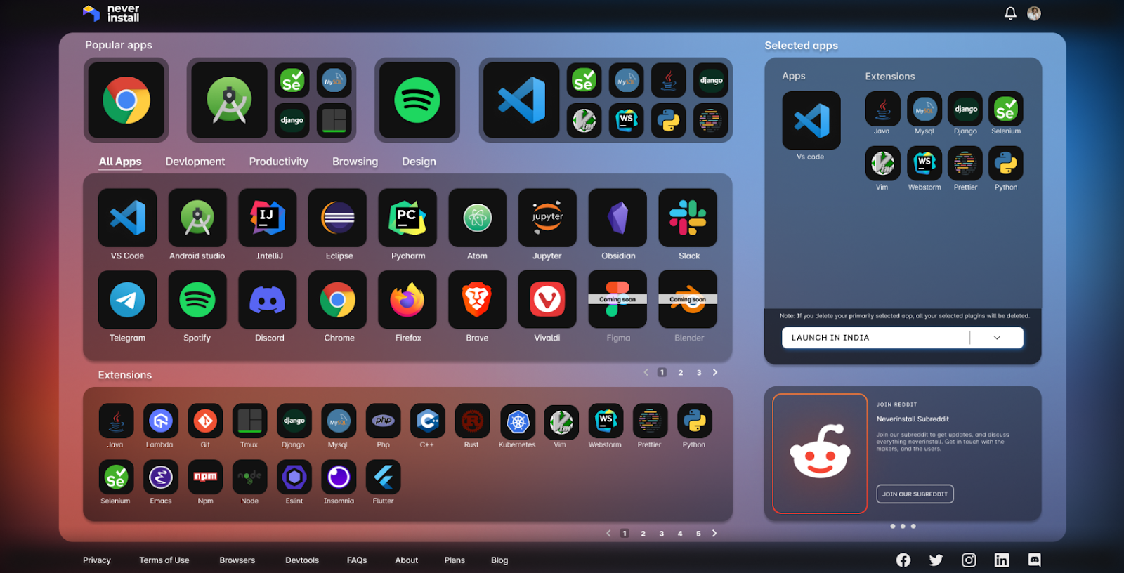
Neverinstall 2.0: Spaces – Native on the Cloud
In August of 2022, we introduced one of the biggest changes to the platform with the introduction of Spaces–a completely new way to use applications on Neverinstall.
Here we used the concept of Glass Morphism. Using the properties of glass to make the elements look translucent.
The Spaces launch collated every application on the platform on a single page, with a section of pre-curated applications for popular use cases and a section with pagination of apps based on category. Further, a section that contains all extensions and plugins.
The new look incorporated a selection tray that allowed users to easily view which apps would be available once they launch their Space.
Dark mode
We heard our users and launched one of the most sought-after updates to the platform–the dark mode. Easier on the eyes, we adopted a darker theme for the platform coupled with vibrant graphics and improved visibility.
Transitory page – something for everyone
We also created a transitory page for users. Earlier, the app build flow would restrict users from entering the workspace and prevent them from extracting any value from the process.
![]()
We solved this by creating a new transition flow for the platform, extending more information to our users, including their internet speed, allocated resources, usage statistics, and even a Twitter share button.
Colour Gradient
Colour gradients are defined as a gradual blending from one colour to another. With these gradients we can make users focus on a particular element or button in the order we want them to.
We can explain this using our current design.
Our brain is always attracted to the warmer shades first. And hence we have used red in the places where we want to grab the user’s attention first.So anyone who views this page will be drawn to selecting the apps from our collection
Our brain’s attention is later drawn towards cool shades, and hence we have used the colour blue. After selecting the apps the users will go ahead to launch them.
This is how we guide the users with just colours. Experience now
What’s ahead?
As we move on to the next year, we are excited to share a quick glimpse of what 2023 holds. We’ve been working to make the platform more intuitive, and many more updates (and upgrades) will materialise in the following year.
Here is a sneak peek of what is up next at Neverinstall.
BYOC- Bring your own cloud
The user can host Neverinstall’s API using any cloud provider’s resources. This feature allows users to now enjoy Neverinstall’s computing power in different environments.
Teams by Neverinstall
The teams launch will introduce a new cloud computing paradigm for businesses and professionals. The Teams launch will give users access to an employee dashboard and an admin panel to gain control over their resources, usage, and more.
Meet the team!
We are proud of the wonderful designers that make Neverinstall a success, and we'd like to introduce you to them!
Vishal Verma, Product Designer
An architect turned Product designer, Vishal has worn many hats. From trekking mountain tops and guiding jungle trails to being an educator and training the minds of the future–he is one of the most interesting pieces that complete the Neverinstall jigsaw.
Sharwari Jangale, Product Designer
A gold mine of ideas and a master of rapid iterations, she has been critical to the success of the various iterations of the platform. Moving through three versions of the platform, she has truly been a key component of the evolution of Neverinstall.
Rajes Parte, Brand designer
With a genuine passion for creative designs, he has been contributing to building a brand image that accentuates Neverinstall's vision.


